

This car model or that one? These sneakers or those? If you're like most people, you spend a fair bit of time comparing and contrasting when you make a purchasing decision, whether it's a new dishwasher or a night out for sushi.
 Now take all that time, effort and research for relatively ordinary consumer items and imagine multiplying it for the research that goes into investing in a new business location. You don't just need great data, an intuitive interface and ease of sharing, you also need to be able to quickly compare the communities that make your long and short lists.
This is a critical step for site selectors and businesses making location decisions after they've considered all the important criteria for different communities and located suitable properties for any business. It's how decision are made and justified. While our popular standalone comparison Intelligence Component has helped them do that for years, we've now built this powerful functionality directly into the industry's leading online GIS data tool, ZoomProspector.
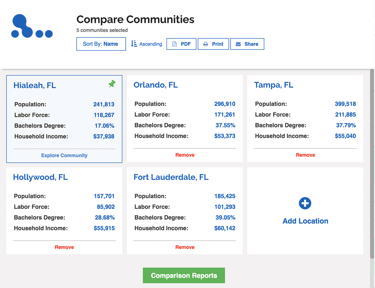
The new Compare Communities feature is easy to access - you'll see it in a tab in the header at the top. Alternately, if you're analyzing regions in the Community Data section, you'll see Compare in the tiled card for every community listed, whether they are a city, county, region or state/ province.
You can begin adding locations to compare - as many as you want - directly from the Compare Board (see image above). You'll have to start with an area from inside the geography of the client whose site you are visiting, and then you can begin adding others from across the state/ province or the entire country. You'll see key data points at a glance right there on the Compare Board but if you need really detailed, granular data, click on Comparison Reports at the bottom.
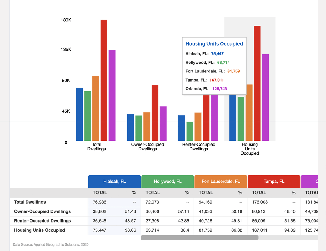
Once you're in the full comparison reports, you'll notice a few great features:
- Charts at the top, table down below - Colorful charts visualize the data variables selected from the table below, making it easy for your website visitors to quickly research, understand and illustrate complex data
- Pin a community to the front of the table - By clicking on the pin icon, you can anchor one community to the first column of comparative data and scroll through the others so you can see each of them side by side
- Switch from total to % - Choose how you want to view and present the data
- Easy to share in a variety of formats - As always, it's easy to share this data in a variety of formats, including unique share links, on your social media channels, in emails or even as downloadable old school PDFs.
Want to learn more about how ZoomProspector can help drive investment to your community? Schedule a customized assessment and demo today.