

A few months ago, I found myself chatting with a new acquaintance at a networking event in the U.S. As people do at such events, they ask where I'm from.
"Montreal," I reply.
This factoid usually elicits one of several responses: a compliment on my spoken English (which happens to be my mother tongue), a comment about the Montreal Canadiens' chances at the Stanley Cup this year (20-1, according to Sportsnet), a reference to Prime Minister Justin Trudeau (never met him, unfortunately), or a story about someone they know in Canada.
"Never been to Montreal, but my cousin lives in Vancouver. It's beautiful there. Do you get over there often?"
Vancouver is indeed a beautiful city. But it is very, very far away from Montreal. Miami is closer to Montreal than Vancouver. Even Dublin, Ireland is closer to my hometown.
I completely understand why my new acquaintance would not know this. Montreal and Vancouver are both in Canada and it can be very hard for anyone to recall the sheer distance from memory. But as luck would have it, we happened to be standing next a poster depicting a stylized map of North America. I pointed out the island I live on in the middle of the St. Lawrence river. She pointed to her home base of Houston. Turns out Montreal and Houston are closer to each other than Montreal is to Vancouver. Who knew?
You probably get where I'm going with this. It was immediately apparent to both of us how much easier it is to absorb complex information - especially spatial information - through visuals. Maps are the most obvious tool, but charts, graphs and infographics all play a big part. And there are plenty of reasons for this:
- Visuals are processed 60,000 x faster than text
- Content with visuals gets 94% more total views than text alone
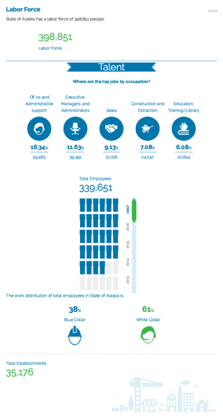
- Infographics can improve website traffic by 12% (see the Labor Force Infographic for the State of Alaska at right - click through to see it live)
- Interactive visuals (dynamic maps, time series infographics, customizable heat maps, etc.) significantly lower bounce rates on economic development organization websites by keeping visitors engaged
- 98% of site selectors research and analyze locations on their websites, so it's critical to give them the tools to do so
GIS Planning microsite templates and online data tools have always been industry leaders in data visualization. Some of the many ways we make data visual for our clients' website visitors:
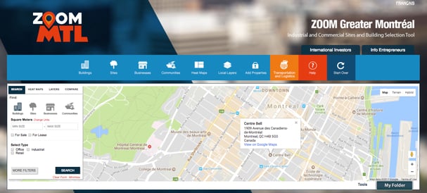
- Thematic heat maps (seen in the image at the top) illustrate how data functions geographically by inviting website visitors to create (and share) their own maps
- Mapping thousands of different variables make it possible to quickly communicate important details that would impossible to absorb through text alone
.jpeg?width=320&name=chart%20(1).jpeg)
- Infographics offer interactive, mobile-friendly data snapshots of key facts about their location, as in the image above
- Charts and graphs translate complex data into images that let us instantly grasp relationships
- Annotated, interactive mapping invites website users to easily delve into and analyze large data sets
- Comparisons are instantly grasped when data sets are visualized side by side
- Visual tools such as radius, polygon, pinpoint, and measure make visual analysis easier, faster and simple to share with others
Want to learn more about how your organization can use visual tools to help site selectors and businesses making location decisions? Contact us today for a free customized assessment and demo of our GIS online data tools.